
Start With the Viewing Distance, Not the Space Alone
The first mistake many people make is measuring the wall or fence and stopping there. A banner can fit a space and still be too small to read, especially beside a busy road or across a hall. Think about how far away people will be when they first see it, then size the message for that distance.
As a simple guide, short text and a logo can work on a smaller banner near a counter or doorway, while roadside banners need bigger lettering and more open space. If drivers only get a second or two to read it, the size must do more of the work.
- Close viewing, such as counters or tables: smaller format, less text
- Medium viewing, such as fences and shopfronts: balanced size with clear headings
- Far viewing, such as roadsides and open fields: larger format with bold type
Fence Banners Need to Match the Fixing Points
Fence banners are common for school events, sports days, market stalls and building sites across Paarl and Wellington. Here the size should follow the fixing points on the fence, not just the artwork. If the ties sit too far apart, the banner can ripple in the wind or pull unevenly.
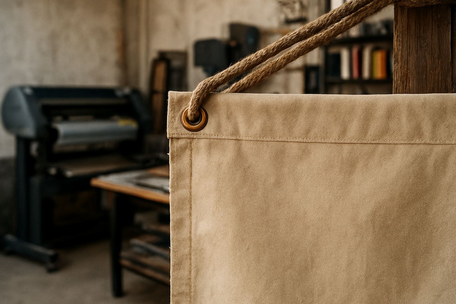
For longer fence runs, it often works better to split a message across two or three banners rather than forcing one very long print. That makes transport easier, and it also helps with replacement if one panel gets damaged or moved. In coastal and windy parts of the Boland, a slightly smaller banner with proper eyelets can last better than an oversized one that takes too much strain.
- Measure the usable fence area only, not the full boundary
- Leave space for rope, cable ties or hooks
- Avoid placing key words too close to the edge
- Ask whether the banner must survive wind, dust or rain exposure
Halls and Indoor Events Need Readable Distance, Not Just Big Print
In halls, church venues, club rooms and expo spaces, banner size depends on where people enter, where they stand and where the main stage or display sits. A banner at the back of a hall needs stronger type than one above a table or behind a speaker. If the room is wide, a tall banner can be more useful than a very long one.
Indoor banners are often photographed too, so the size should work both in person and in pictures. If the banner will appear behind a podium or display table, keep the main message high enough to stay visible when people stand in front of it. For events in Stellenbosch, Franschhoek or Worcester, where venues vary a lot, it helps to measure the exact wall height before artwork is finalised.
- Stage backdrops: larger size with a simple layout
- Directional event banners: smaller but legible from a distance
- Photo wall banners: enough width for people to stand in front safely
Roadside Banners Need Bold Type and Safer Proportions
Roadside banners are about fast reading. A banner near a national road, a provincial route or a busy local street in the Boland must carry a short message with strong contrast. Too much wording makes the banner look busy and the main point gets lost before a driver has passed.
For these jobs, size and proportion matter as much as colour. A taller banner may be better if the message needs breathing room, while a wider banner can suit a short slogan, date or directional arrow. If the banner is going up near traffic, we also look at wind load, fixing strength and whether the site needs approval from a property owner or local authority. That is especially important when banners hang close to roadsides, entrance points or municipal fencing.
Keep these points in mind:
- Use fewer words and bigger letters
- Choose a size that allows margins around the text
- Allow for wind movement so the banner does not flap too hard
- Check whether the banner will be read by pedestrians or passing traffic
Counters and Small Display Areas Need Tight, Clean Layouts
Counter banners, pull-up style displays and small indoor signs need a different approach from street banners. The space is tighter and people usually stand close. That means the artwork can carry more detail, but only if the layout stays clean and organised. A small banner with too many lines of text can become hard to read even at arm's length.
For reception areas, point-of-sale tables and launch counters, choose a size that leaves enough white space around your logo and message. The aim is to look tidy and direct, not crowded. If the banner must sit on a table in a busy retail space, the bottom edge also needs enough clearance so it does not get hidden by products, bags or elbows. A neat finish matters here, because small displays are often handled often and moved around.
- Keep text short and focused on one main message
- Choose a format that fits behind or beside the counter without blocking walkways
- Ask for edge finishing that suits repeated handling
A Paarl Example: From Silo Court to Street Corner
A local business in Paarl wanting a banner for a weekend promotion may have two very different needs. One banner could hang across a fenced area near a busy road, while another sits inside the shop for walk-in customers. The roadside piece needs larger lettering and stronger fixing points, while the indoor one can be smaller and more detailed. If both are treated the same, one will usually be too small or the other too heavy for its space.
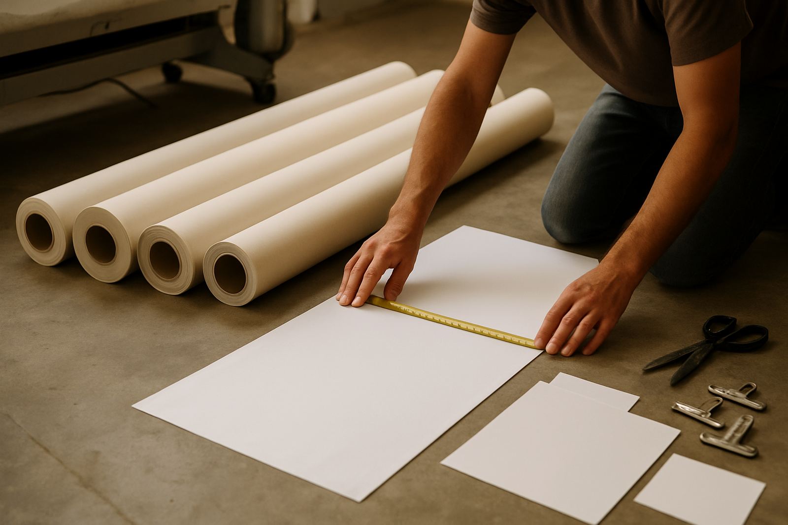
This is where a proper size check saves time and reprints. We look at where the banner will hang, how far people are from it, what wind it will face and whether the message needs to be seen from one direction or both. A banner for Wellington on a windy corner may need a different size from one for a hall in Franschhoek or a fence line in Malmesbury. Small differences in placement can change the right size quite a lot.
Before ordering, it helps to gather a few simple details:
- Exact width and height of the available space
- Where people will view it from
- How long the banner must stay up
- Whether it will face wind, dust or direct sun
- Whether it needs eyelets, hemming or another finish
The Best Banner Size Is the One That Fits the Job
Banner size planning is not guesswork. It is a practical mix of measurements, message length and the real conditions on site. A fence banner, hall banner, roadside banner and counter banner all serve different purposes, so they should not all be treated the same way. The more clearly you define the space and the viewing distance, the better the final result will read.
When you are planning a banner for Paarl, Wellington or anywhere across the Boland, start with the site and work backwards from there. That is the simplest way to avoid a banner that is too small to notice or too large to handle properly. A little planning at the start can save money, improve visibility and cut down on avoidable reprints.