Franschhoek Menu Boards
Home / Projects / Franschhoek Menu Boards

Projects

Franschhoek Menu Boards

For a compact food outlet in Franschhoek, we produced printed menu panels and takeaway window signs that could be read quickly from the street and inside the queue. The brief called for clear pricing, tidy branding and materials that would hold up to daily cleaning, heat and bright window light.

A compact takeaway needed clear pricing at a glance

The client was a small food outlet in Franschhoek serving walk-in customers, takeaway orders and quick counter sales. The owners needed menu boards that could be updated without redoing the whole shop, plus window signs that made the takeaway point easy to spot from the pavement.

The space was tight, so every square metre counted. There was limited wall space behind the counter, strong sunlight across the front windows, and regular moisture from cleaning and food prep. The signs also had to suit a historic town setting, where too much visual clutter can feel out of place. We kept the layout clean, legible and practical.

We worked from the outlet’s existing menu list and pricing, then tightened the text so each item could be read in one glance. That meant shortening line breaks, separating meal groups and using strong contrast. In a busy lunch rush, customers do not stop to study a board, so the lettering had to do the job fast.

What we supplied for the Franschhoek fit-out

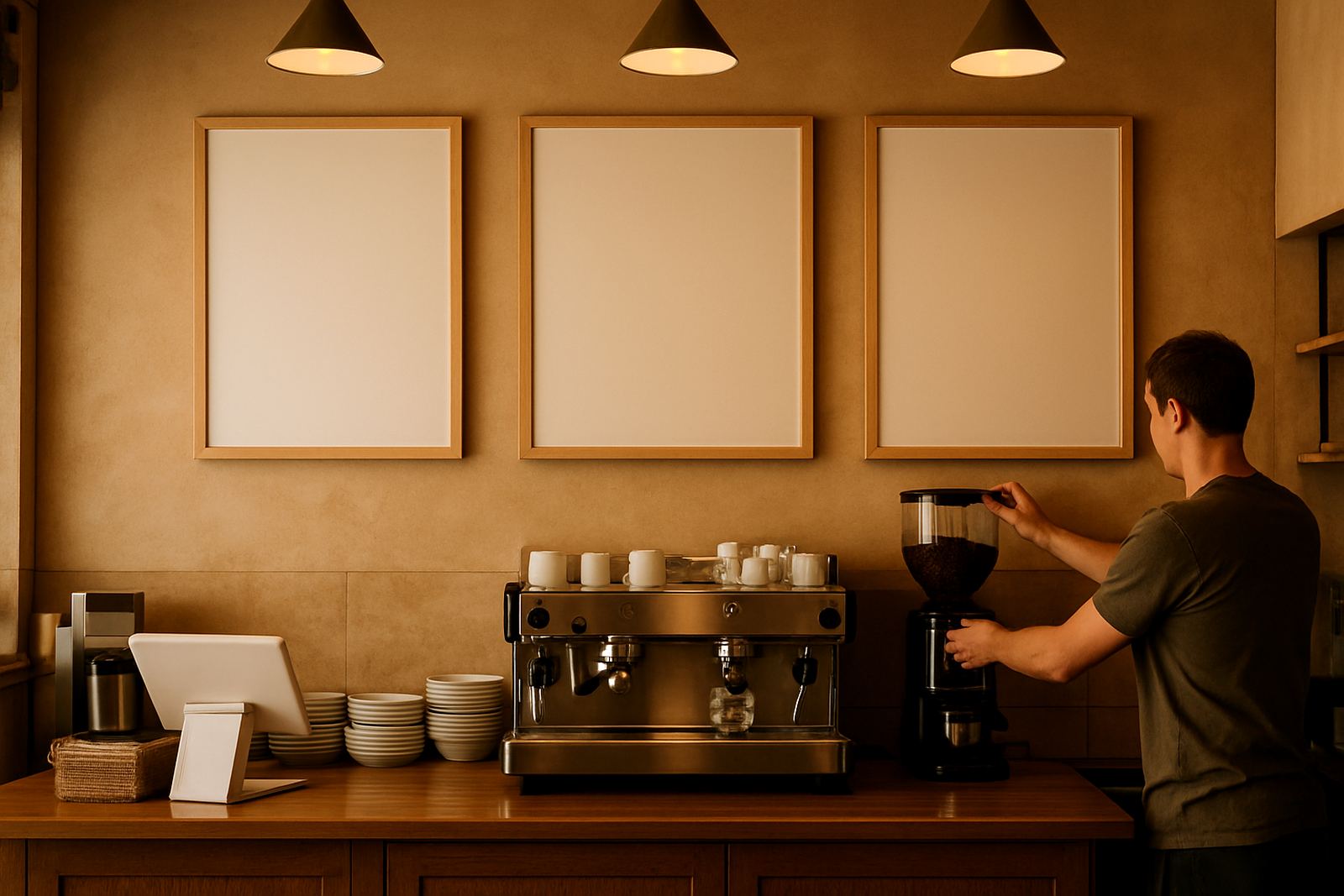
We supplied printed menu panels for the main ordering point and window signs for the takeaway side of the front glazing. The panels were sized to suit the counter wall and kept in easy-to-replace sections so menu changes later on would not mean a full reprint. The window signs were cut to fit the glass line, with enough breathing room around the edges so they looked planned, not squeezed in.

  • Printed menu panels for the counter area
  • Takeaway window signs for street-facing glass
  • Artwork checks for spelling, spacing and pricing layout
  • Vinyl cutting for clean lettering and logo elements
  • Lamination for wipe-down durability
  • On-site fitment with neat alignment and finish trimming

We used a mix of printed panels and cut vinyl because the outlet needed both flexibility and durability. The printed sections carried the food items and prices, while the cut vinyl gave the branding a cleaner look on the glass. That approach kept the cost sensible and made future updates easier.

Material choices for sun, steam and daily cleaning

Franschhoek can be harsh on signage when glass gets full sun during the day and condensation builds up inside near the kitchen. For that reason we selected materials that could handle repeated wiping and still keep the print sharp. The menu panels were finished with a protective laminate, and the window graphics were prepared for firm adhesion on smooth glass surfaces.

We paid close attention to contrast, because some menu items were photographed or printed in small type on the original list. Fine detail can disappear quickly once it is on a wall, especially under downlights and bright daylight. We adjusted the artwork so the headings were bolder, the prices lined up properly, and the smaller notes still remained readable at about two to three metres away.

The outlet also wanted the front to stay neat during load-shedding periods, when lighting changes can make gloss surfaces look different. A finish that looks good in full daylight but also reads well under indoor light makes a real difference. Small detail, but it matters when people are standing in a queue.

Timeline from artwork check to final fitment

The project ran over two weeks from first brief to completed installation. In week one we reviewed the menu content, checked spelling and layout, then prepared the print files. We also confirmed sizes against the site measurements so the panels would line up with the available wall and window space.

In week two we printed, laminated and cut the components, then fitted them on site in Franschhoek. The installation had to be done around the outlet’s trading hours, so we worked in a short window and kept the site tidy. No one wants excess scraps or adhesive marks left behind when customers are coming in and out.

  • Week 1: brief, artwork checks and sizing
  • Week 2: printing, lamination, cutting and fitment
  • Final handover: visual check, cleaning and sign-off

The result was a faster, calmer install than if the team had waited until trading pressure was high. Planning the fit around the shop schedule also reduced downtime, which was important for a small outlet with steady lunch trade.

Results on the street and at the counter

Once the new menu boards and window signs were in place, the outlet had a clearer street presence and a more organised ordering point. Customers could see the takeaway side sooner, and staff spent less time explaining where to order. That matters when the queue is moving and people just want quick service.

The updated signs also gave the shop a more polished front without making it look overdone. The branding sat comfortably in the glass and counter area, and the prices were easier to follow. For the owners, that meant fewer questions at the till and a cleaner way to present specials or seasonal changes later on.

If we were to do this type of job again, we would keep the same structure: strong menu hierarchy, laminate protection, and modular panels for easy updates. For compact food outlets, that combination is practical. It keeps the front tidy, the information visible, and the print work useful for longer.

What we would repeat for similar food outlets

This Franschhoek job showed why menu signage has to be designed around how people actually buy food, not just how it looks in a mock-up. A board that works in a spacious restaurant may fail in a small takeaway where the counter is tight and the glass catches glare. We would use the same approach again for cafés, bakeries and lunch spots across Paarl, Wellington and the wider Boland.

  • Keep the menu list short and well grouped
  • Use strong contrast for pricing and headings
  • Choose wipeable finishes for food service areas
  • Size graphics to the actual wall and window openings
  • Plan installation around trading hours

For businesses in towns like Franschhoek, the best signage is often the kind that quietly does its job every day. It helps customers find the counter, read the menu without squinting, and place an order faster. That is where good print and careful fitting pay off.

Key facts

Client typeCompact food outlet in Franschhoek
Project scopePrinted menu panels and takeaway window signs
Turnaround2 weeks from artwork check to fitment
MaterialsPrinted panels, cut vinyl and protective laminate
Key sizesMixed panels sized to counter wall and front glazing
Service areaFranschhoek, Paarl and the wider Boland

What our Print and Sign customers say

Verified Google reviews

Questions we get asked

Can menu boards be updated later without replacing everything?

Yes. We can set them up in sections so prices, specials or item names can be changed with less rework and lower cost.

Do window signs hold up to sun and cleaning?

With the right vinyl and laminate, yes. We use finishes suited to bright glass, regular wiping and daily trade conditions.

Can you fit signage outside normal trading hours?

Yes. We plan around business hours where needed so the install does not interrupt service or create unnecessary downtime.

Planning something? Send the team a message.

Contact form