A practical sign package for a busy Worcester site
The client needed one coordinated package for a new working site in Worcester, with signs that could do more than just look tidy. The main goal was to make access points, restricted areas and required safety actions easy to understand at a glance, even for visitors arriving for the first time.
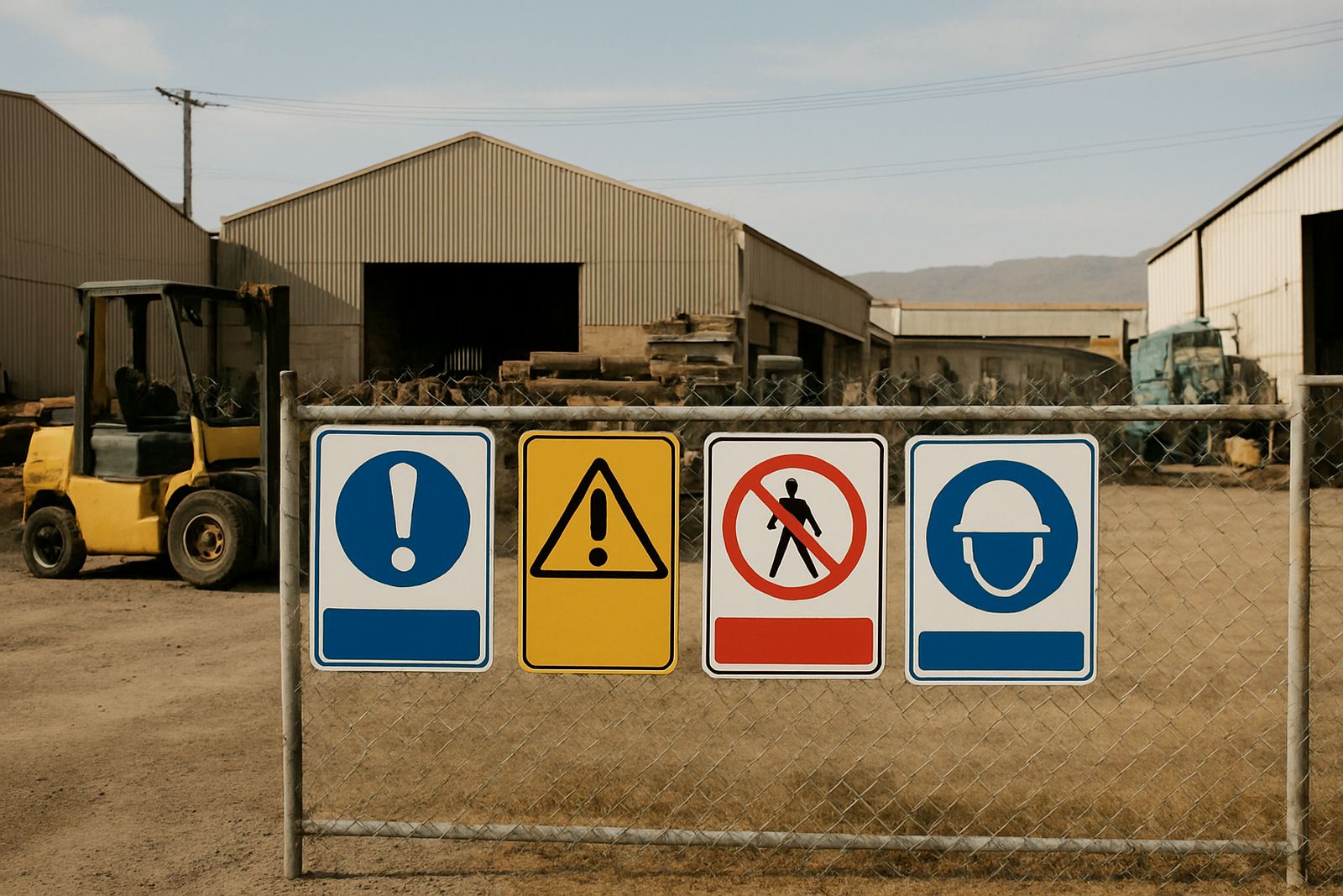
We worked from the site layout and the required message list, then grouped the jobs into three parts: mandatory boards, warning boards and access markers. That meant fewer loose items on site and a cleaner handover for the client’s team. The layout also needed to suit a mix of foot traffic and vehicle movement, so visibility from a short distance mattered just as much as the wording.
- Mandatory PPE and access control signs
- Warning boards for moving vehicles and work zones
- Directional markers for entry, exit and no-go areas
Material choices that hold up in the Boland
Worcester can be hard on signage. Summer heat, dust, strong sun and the odd bit of wind all add up, and on some sites the boards also need to survive load-shedding related downtime and long hours with no one standing nearby to keep an eye on them. We chose materials that stay readable and keep their shape without fuss.
The boards were produced on rigid panel stock with high visibility print and protective finishing where needed. For exposed points we used weather-suited face graphics and clean edge finishing so the boards could be fixed neatly to fences, posts and walls. Sizes varied by location, but the main boards were set at 600 x 450 mm and 900 x 600 mm for stronger visibility from vehicle approach routes.
- Rigid board construction for fixed installation
- UV aware print for outdoor use
- Options for drilled fixing points or adhesive mounting
Artwork checks, compliance wording and final set-up
The biggest constraint was accuracy. Safety boards must say the right thing, and they must say it in a way people understand quickly. We checked the supplied wording, cleaned up layout spacing and made sure the symbols, arrows and text matched the purpose of each board. A few areas needed bilingual clarity, so we kept the message plain and direct rather than crowded.
Because the boards were going into a working environment, we also kept the design consistent across the set. That helped the site team recognise which areas were mandatory, which were warnings and which were directional. It sounds simple, but on a real site simple is what works best and it saves confusion later on.
- Artwork checking and layout correction
- Consistent board styling across the site set
- Clear symbol use for quick reading on foot and in vehicles
What we supplied for the Worcester safety board order
We supplied a full set of boards and markers, all prepared for straightforward installation. The package included mandatory notices for personal protection, danger and access points, plus site guidance boards for staff and visitors. Where the client needed repeated wording for different locations, we produced matching sets so every point on the site had the same look and message.
The work also included finishing details that matter on real jobs, like clean trimming, mounting preparation and the correct sizing for the planned fixing points. In some cases we pre-drilled the panels, which made on-site fitting quicker and reduced the chance of damage during install. Small choices like that save time, especially when a team is trying to keep the site moving.
- Mandatory, warning and directional boards
- Pre-drilled fixing where needed
- Matched repeat signs for multiple access points
Timeline from brief to delivery in under three weeks
The full job ran over just under three weeks from briefing to supply. Week one was for layout confirmation, site message grouping and artwork checks. Week two covered printing, finishing and quality control. In week three we completed the remaining items and prepared the order for handover.
That timeframe suited the client because the site was moving in stages. It gave enough room to check the wording properly, but it still kept the project ahead of the main installation date. We kept the process simple, with one main point of contact and clear approval stages, so there was no back and forth over the same details.
- Week 1: brief, wording and artwork checks
- Week 2: printing and finishing
- Week 3: final supply and handover
Results on site and what we would repeat
The final result was a practical, well ordered safety sign set that made the site easier to manage. Staff could see the right boards at entry points, drivers got better direction, and visitors had fewer chances to wander into the wrong area. The client wanted clarity and durability, and that is exactly what the finished package delivered.
If we were doing the same project again, we would follow the same approach: start with the site plan, group the messages properly, then match the board sizes to the viewing distance. We would also keep the installation notes ready from the start, so the client’s team can fit the boards quickly without guesswork. That simple workflow works well for safety signage in Worcester and across the Boland.
- Clearer movement around access points
- Better visibility for staff, contractors and visitors
- Simple fitting process with repeatable board sizes
Key facts
| Client type | Commercial site team in Worcester |
|---|---|
| Project scope | Mandatory signs, warning boards and access markers |
| Main materials | Rigid outdoor boards with finished print faces |
| Board sizes | 600 x 450 mm and 900 x 600 mm |
| Timeline | Just under 3 weeks |
| Service areas | Worcester, Paarl, Wellington and the wider Boland |