Why Readability Beats Fancy Lettering Every Time
A sign has one main task: be read quickly. On a busy road in Paarl, at a gate in Wellington, or on a shop front in Franschhoek, people often have only a second or two to take in the message. That is why plain, well-spaced lettering usually works better than decorative fonts that look attractive close up but turn into a blur from the pavement or the car window.
For business signs, safety signs, vehicle lettering and directional boards, the best font is the one people can recognise without effort. Fancy scripts, thin strokes and tightly packed letters may suit a wedding invitation, but they are a poor choice for a sign that must carry a business name, opening hours or a warning. When in doubt, choose clarity first and style second.
Choose Fonts That Match the Viewing Distance
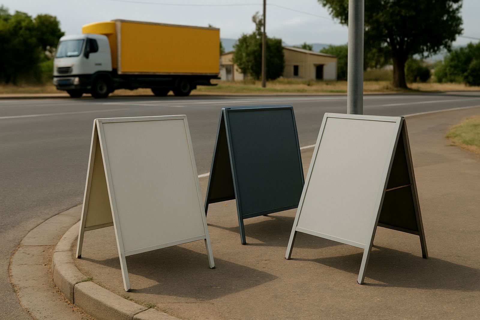
The right font depends on how far away people will read it. A small window sign outside a salon in Malmesbury needs different lettering from a light box on a roadside in Worcester. Short viewing distance allows a bit more character. Longer viewing distance calls for simple letterforms with strong contrast and enough space between each character.
- For close-up viewing, use clean sans serif or simple serif fonts with medium weight.
- For passing traffic, use bold, upright fonts with open counters and wide spacing.
- For safety notices, use maximum legibility over style and keep words short.
- For vehicle wraps, check how the font holds up when curved over panels and doors.
As a rule, if the font still reads well when seen from across the room, it will usually behave better outdoors too.
What Works Best for Shopfronts, Vehicles and Safety Signs
Different sign types ask for different lettering. A shopfront sign can carry a slightly more branded feel, while a municipal or workplace safety sign must be plain and direct. Vehicle graphics need letters that stay clear on curved panels, near handles and around wheel arches. That means avoiding thin strokes and over-compressed styles that disappear once they are cut, laminated or fitted.
In the Boland, weather matters as much as style. Bright sunlight, coastal humidity and dust can all affect how a sign is seen and how it ages. Dark lettering on a pale background often gives the strongest contrast, especially for outdoor boards and vehicle decals. For illuminated signs and light boxes, the font should remain legible after dark and not lose shape when the light comes through. A good font is not just pretty, it has to hold up in real conditions.
- Shopfronts: use clear branding with one strong font and limited wording.
- Vehicle wraps: keep lettering bold enough to stay readable from the roadside.
- Safety signs: use standard-style lettering, strong contrast and no clutter.
- Temporary banners: use large text sizes because people usually read them in motion.
Spacing, Weight and Contrast Matter as Much as the Font Name
People often ask for a specific font, but the spacing around the letters can matter just as much. If letters are crowded, the eye has to work harder. If the strokes are too thin, the sun can wash them out. If the colour is too close to the background, the message loses strength. Small changes can make the same wording far easier to read.
Tracking, line spacing and contrast should all be checked before anything is printed or cut. On a vinyl sticker, for example, a font that looks fine on screen may need adjusting once it is reduced to size. On a printed banner, the same wording may need bigger line spacing so the message breathes. Good artwork checks catch these problems early, before material is used and time is wasted.
For a sign that must be read quickly, avoid putting too many words in one line. Break long messages into short lines and keep the key word strongest.
Local Example: A Paarl Delivery Fleet Needs Clear Lettering
Take a local fleet operating between Paarl, Wellington and Simondium. The vehicles may be on the road all day, in town traffic, on the N1 or parked at a client site. A driver name, contact line and business service need to be visible without clutter. In this kind of work, a bold sans serif font with strong spacing is often the safest choice. It reads well from a distance and still looks neat on doors, tailgates and side panels.
Now compare that with a narrow script font squeezed onto the same panel. It may look stylish on the artwork proof, but once the vehicle is moving it becomes harder to read, especialy in bright light or when the car is dusty. The better choice is the one that helps people recognise the vehicle fast and remember the name after it passes.
This same principle applies to shop signs in Franschhoek, workshop boards in Worcester and farm signs outside Malmesbury. The right lettering saves time for the viewer, and that is the point.
When to Reprint, Refresh or Replace Old Lettering
Signs do not last forever. Sun, wind and cleaning products all wear them down. If a sign has faded, cracked or lost contrast, the font may still be the same but the message is no longer clear. That is when reprints and updates make more sense than trying to keep an ageing board going for another season.
Signs should be reviewed if the business has changed contact details, added a new service or expanded to another area. A clear font cannot fix old information. It is better to update the wording, check the layout and make sure the message still suits the site. In some cases a simple refurbishment is enough, in others a fresh sign is the cleaner option.
- Reprint if the message is still right but the material is worn.
- Refresh if the lettering has faded or the contrast is gone.
- Replace if the sign no longer fits the business or the site.
- Check fitted signs after storms, strong sun and load-shedding related downtime at lit premises.
How Catprints and Signs Approaches Font Choice
We work with businesses, riders and drivers across Paarl, Wellington and the wider Boland to make sure the lettering suits the job. That means checking the artwork, size, surface and viewing distance before anything is printed, cut or installed. A font that looks good on a flyer may need adjusting for a banner, a magnet or a vehicle wrap. We look at legibility first, then shape and finish.
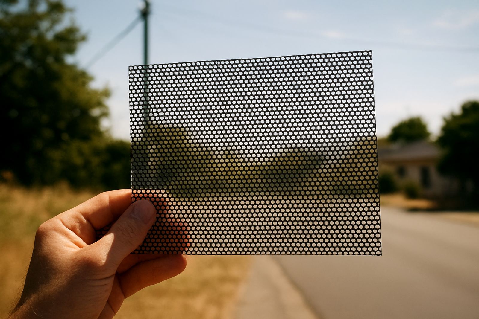
Good sign lettering should feel simple once it is in place. The reader should not have to stop and puzzle it out. Whether the job is a safety sign, a canvas print, contra-vision on a window or a light box for a shopfront, the right font keeps the message honest and easy to take in.
If the words matter, the lettering must support them. That is the rule we work by, and it saves a lot of trouble later.