
Why some illuminated signs read better after dark
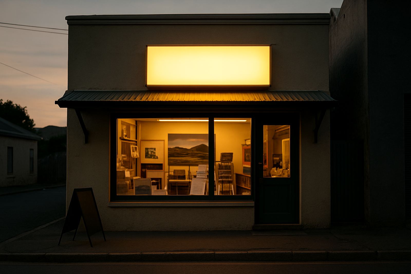
People do not stop and study a sign at night. They glance, decide and move on, often while driving or walking in low light. That is why light box visibility is about more than simply fitting a lamp behind a panel. The message has to stay clear from a distance, at an angle, and in changing light from sunset through to late evening.
In the Boland, that matters for shops on busy roads, workshops near mixed traffic, and service businesses that depend on evening footfall. A sign that looks bright enough in the workshop can disappear outside if the face material is too opaque, the letters are too thin, or the lighting is uneven. Good visibility starts with the brief, not the bulbs.
Face materials, colour contrast and letter spacing
The front panel of a light box controls how much light gets through and how evenly it spreads. A translucent face helps the sign glow across the full panel, while strong contrast between text and background makes the message readable at speed. Dark colours can work very well, but they need careful handling so the letters do not lose definition at night.
Small text is the first thing to suffer. If the copy is too long or the font is too thin, the sign becomes hard work for the reader. Keep the wording short, use enough spacing between letters and avoid decorative styles that break up at a distance. For road-facing signs, a simple layout usually performs better than one packed with detail.
- Use short words and fewer lines where possible
- Choose a typeface with clean, open letterforms
- Keep key words large enough to read from moving traffic
- Test the design in daylight and at night before final fitting
Lighting that stays even and economical
A bright sign is not always a better sign. What matters is even light across the full panel, with no dark patches at the corners or hot spots in the middle. Uneven lighting can make a logo look patchy and can leave smaller text fading into the background. For larger boxes, the spacing of the light units inside the casing needs proper planning so the whole face carries evenly.
Energy use is another practical point. Businesses running through load-shedding or managing higher power costs want a sign that does the job without wasting electricity. Efficient lighting inside the box helps with running costs and reduces heat build-up, which is useful in summer and in enclosed shopfronts. It also means less strain on the fittings over time, which is important for signs that stay on for long evening trading hours.
Placement at street level, height and viewing distance
Even a well-made illuminated sign can fail if it sits in the wrong place. Height, angle and surrounding clutter all affect how quickly a customer sees it. If the sign is too high, the driver catches only a quick flash. If it is hidden by trees, shade cloth or other frontage elements, the message disappears before it can do its work.
In Paarl and Wellington, many businesses have frontage facing sun, dust and passing traffic at different speeds. A sign near a main road may need to be read in seconds, while a sign above a walkway can carry more detail because people have more time. The viewing distance should guide the size of the box, the size of the lettering and the amount of information on the face. A simple rule helps: if customers need to slow down to understand the sign, it is probably carrying too much copy.
- Keep the main message visible from the nearest approach point
- Avoid placing signs behind trees, poles or deep overhangs
- Consider glare from headlights, streetlights and nearby glass
- Match the box size to the actual viewing distance
Weather, dust and coastal air in the Boland
Local conditions matter just as much as the design. Dust, wind and summer heat can affect how a light box performs, while moisture and coastal air can work their way into joins and fittings over time. In areas closer to the coast, corrosion resistance becomes a real concern. Inland, heat and fine dust can still mark the face and dull the brightness if the sign is not properly sealed.
That is why the casing, mounting method and finish all need attention. A sign installed for a shop in Malmesbury may face different wear than one on a vehicle yard in Franschhoek or a business site in Worcester. The aim is to keep the face clean, the light output steady and the structure secure enough for daily use. Regular cleaning helps too, because a dusty face can reduce visibility more than people expect.
If a sign is planned well, it can handle the practical realities of the region without constant fuss. If it is not, the owner soon starts dealing with dim corners, loose fittings and a message that no longer stands out after dark.
A Paarl example: what works for evening trade
Consider a takeaway, workshop or retail point in Paarl that trades into the evening. Customers may be coming from Wellington, passing through town on errands, or arriving after dark when the road is busy and attention is split. In that setting, the best sign is the one that can be understood in one glance, without needing to slow traffic or overcomplicate the frontage.
A clear brand name, one simple service line and strong contrast are usually enough. If the business offers multiple services, those can be supported elsewhere on the frontage or on smaller directional signs. The illuminated box itself should carry the main message first. That approach helps drivers and pedestrians alike, and it avoids the common problem of trying to make one sign do every job at once.
- Lead with the business name and main offer
- Use secondary information on separate signs if needed
- Keep the illuminated face easy to scan in poor light
- Plan the sign for the real street view, not just the workshop wall
When to replace, update or refurbish an existing light box
Not every visibility problem means starting from scratch. Sometimes the casing is sound and the face simply needs updating. Other times the sign still works structurally, but the artwork is outdated, the lighting is tired, or the original layout no longer reflects the business. Reprints and updates can restore clear reading at night without changing the whole installation.
If the sign has been through a few seasons, check for fading, uneven brightness, cracked faces and water ingress. Those are the warning signs that visibility is slipping. A refurbishment can also be a chance to improve the message, clean up the layout and bring the box in line with current trading hours or services. For businesses across the Boland, that is often the most practical way to keep a frontage sharp without unnecessary waste.
In the end, light box visibility comes down to a simple promise: can people read it quickly when it matters most? If the answer is yes, the sign is doing its job.