
Start with the job your sign must do
A shopfront sign is not only there to show a name. It has to be read from the road, make sense in one glance, and suit the way customers approach your entrance. In Paarl and Wellington, that can mean shoppers walking past on a narrow pavement, or drivers passing at speed on a busy street with morning glare on the windows.
Before anything is made, decide what the sign must achieve. Do you need people to spot the business from across the road, or do you need a neat sign that sits well above an entrance and matches the building? A sign for a takeaway, motor trade bay, salon or office park all need different treatment. The better the brief, the less guesswork later.
- Identify the main viewing distance
- Decide whether the sign must work for pedestrians, motorists, or both
- Note if the entrance faces sun, wind, dust or coastal humidity
- Check whether the sign must carry trading hours, a logo, or only the business name
Measure the frontage before you choose the format
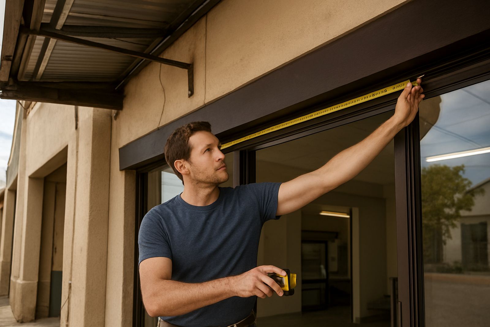
Many sign problems start with a rough estimate. Measure the width above the doorway, the height available, and anything that might block the sign such as security grilles, pillars, awnings or downpipes. A clean width of 3 metres may sound generous, but once you allow for edge margins and fixing points, the usable space is less.
It also helps to note where the electrical supply is, if the sign will be lit, and whether you can access the wall safely for mounting. In older buildings in the Boland, walls are not always square and that can affect panel fitment. If the frontage is on a street with municipal restrictions or a landlord approval process, sort that out before artwork is finalised.
- Measure width, height and clear space around the sign area
- Photograph the frontage in daylight and at night if needed
- Check for uneven walls, cracked plaster or loose cladding
- Confirm if drill fixing, frame fixing or stand-off mounting is needed
Choose the right material for the weather and the budget
Material choice should be practical, not just visual. For a simple entrance sign, a printed board can work well if it is mounted properly and protected from direct weather. For a longer-life option, aluminium composite, cut vinyl, acrylic, or a fabricated light box may suit better depending on the site and budget.
In Paarl, strong sun can fade weak inks quickly. In Wellington, wind exposure can test fixings. Near the coast, even though Boland is not right on the sea, humidity still matters for exposed edges and steel parts. A sign that is properly sealed and finished will hold up better than one made for short-term use only. If the business plans to update prices or services often, a sign with changeable elements may be worth considering.
- Match the material to the lifespan you want
- Ask whether the sign will face direct sun or wind
- Consider moisture resistance for outdoor use
- Plan for easy reprints if trading details are likely to change
Keep the wording short and readable
People should understand the sign quickly. Long lines of text, too many phone numbers, or cramped service lists can make a sign hard to read from the road. Use the business name first, then the most important message. If the frontage is small, clarity matters more than filling every available space.
Font choice is part of readability too. Thin script or decorative lettering can look neat on a screen but may disappear once mounted outside. Bold, simple lettering usually performs better for shopfronts, especially where the sign is viewed from an angle. Colour contrast matters as well. Dark text on a light background, or light text on a darker panel, usually gives better visibility.
- Lead with the name people are searching for
- Limit extra wording to what is truly useful
- Use strong contrast between text and background
- Avoid small lettering that cannot be read from the opposite pavement
Think about lighting, windows and after-hours visibility
Not every sign needs illumination, but some trading entrances lose visibility after sunset. If your business opens early, closes late, or sits in a shaded arcade, lighting can make a proper difference. A light box, halo effect or externally lit sign can help, but only if the position and power supply are planned properly.
Glass also changes the result. If the sign sits behind a window, reflections may affect readability during the day. For doors and windows, contra-vision, vinyl decals or frosting can help manage privacy without blocking light completely. This is useful for salons, offices and reception areas where people want discretion but still need to see the name clearly from outside.
- Check whether the sign must be visible after dark
- Note any window reflections or tinting
- Decide if privacy film or frosting is needed as part of the frontage
- Confirm power access before choosing a lit option
Use the local site visit to avoid fitment mistakes
A good sign order often starts with a site visit or at least clear photos and measurements. This is where small issues show up, like uneven brickwork, security gates, low lintels, or a wall that cannot take the weight you had in mind. In a town like Paarl, where many frontages are mixed with older plaster finishes and newer retail units, each site needs its own approach.
For example, a small hardware shop in Wellington may want one high-visibility sign above the roller shutter and a second panel at eye level for walk-in customers. A wine route business in Franschhoek may need a more refined look, while a trade counter in Worcester might prioritise plain wording and strong visibility from passing traffic. The sign solution should suit the site, not the other way around.
- Use clear site photos from front-on and angled views
- Identify any power, height or access limits
- Ask how the sign will be cleaned and maintained later
- Plan for replacement panels or updates if the business changes
Finish the sign plan before you place the order
Once the size, wording, material and fixing method are settled, you can move to artwork checks and production with fewer surprises. This is the stage where spelling, contact details and alignment must be checked properly. A small error on artwork can be costly once the sign is printed and mounted, so it is worth slowing down here.
Good planning also helps with timing. If the sign needs installation before a launch date, a licence inspection, or a busy trading period, allow enough time for printing, finishing and fitment. For shops in Malmesbury or Stellenbosch, where traffic and access can affect installation windows, it helps to plan around peak trading hours and school runs. Keep the brief simple and practical, then let the sign do its job every day without fuss.
- Confirm final wording before production starts
- Allow time for artwork checks and revisions
- Schedule installation when the entrance is easy to access
- Keep a record of sizes and materials for future updates