
Start with the viewing distance and message length
The first thing to decide is how far people will stand from the sign. A light box for a shopfront on a busy street in Paarl needs different copy from one that is read by passing traffic on the R45 or from the roadside in Wellington. If the text is too long, the message gets cramped and the light has to do too much work. Short wording, strong contrast and a clear layout always read better.
For most illuminated signs, the rule is simple: the further the viewer, the bigger the lettering and the fewer the words. A driver only has a few seconds to read a sign, so the name, service and contact point should be easy to spot. Keep the strongest message near the centre and leave enough open space around it. Busy artwork may look good on a screen, but it can reduce legibility once the sign is lit from behind.
- Decide the main viewing distance before approving the layout.
- Use one clear message where possible, not three competing ones.
- Keep important details away from edges and joins.
- Make sure the sign still reads well in daylight, not only at night.
Choose the right face material for local conditions
The front face of a light box does most of the visual work, so the material choice matters. In the Boland we get strong sun, dust from roads and seasonal humidity, especially closer to the coast or in damp winter months. A face that flexes too much can show ripples, while one that is too heavy can put strain on the frame. The aim is a flat surface that spreads the light evenly and does not yellow too quickly.
For outdoor use, ask for a face that handles UV exposure and regular cleaning. If the sign sits near a bakery, restaurant or workshop, grease and grime may build up faster and need more frequent washing. A well made face should stay taut, keep its colour and allow the light source behind it to shine through without hot spots. If the frame is mounted high, think about how it will be cleaned later because that affects the finish you choose now.
- Check if the face is suited for outdoor UV exposure.
- Ask how it handles heat, humidity and general wear.
- Prefer a smooth finish that wipes clean without clouding.
- Choose colours that stay readable when lit and unlit.
Brightness, colour and visibility after dark
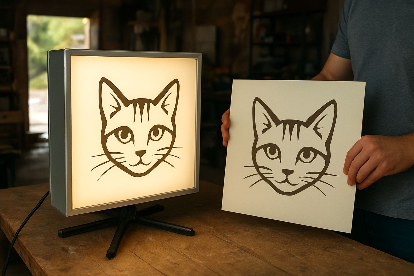
The strongest light is not always the best light. If a box is too bright, it can wash out the artwork and make the message harder to read from close up. If it is too dim, the sign disappears against the night sky. The goal is even lighting across the full face, with no dark corners and no glaring patches. This matters for shopfronts, forecourts and service yards where customers arrive after sunset or during load shedding.
Colour choice also affects legibility. White, yellow and light backgrounds can glow strongly, while dark colours need more careful planning. High contrast helps people read from moving vehicles and from a distance. If your business trades late, test the sign under the conditions it will face at night. A sign that looks fine in the studio can behave very differently once it is outside under street lighting, passing headlights and wet pavement reflections.
- Test the sign in daylight and after dark before final approval.
- Use high contrast between text and background.
- Check for even brightness across the full panel.
- Make sure reflective glare does not hide the message.
Mounting height, wind and power planning
Where the light box is mounted can affect both safety and readability. Too low and it may be blocked by parked vehicles, delivery bakkies or roadside clutter. Too high and the lettering becomes hard to read unless it is sized correctly. The frame also needs enough fixing points for wind, especially on exposed corners and along open roads where gusts can catch the sign. A secure mount is not only about safety, it helps the sign stay aligned and neat over time.
Power planning is just as important. If the site has unstable supply or load shedding, you need to think about when the sign must be visible and whether backup power is needed. Cable runs should be tidy and protected from weather. In wet areas, all electrical parts must be kept properly enclosed and accessible for maintenance. Ask for a mounting plan that suits the wall material, roofline or pole position before fabrication begins, not after the sign is ready.
- Confirm the viewing height from cars, trucks and pedestrians.
- Check wind exposure and the fixing method for the site.
- Plan power access and cable routes in advance.
- Allow for safe servicing without removing the whole unit.
Artwork rules that keep the sign readable
A light box works best when the artwork is prepared with the sign in mind. Fine lines, thin fonts and low contrast images may look sharp on a computer but lose clarity once backlit. Photo backgrounds can also reduce the strength of the message if they are too busy. The cleaner the layout, the better the result. This is where artwork checks matter, because small errors are expensive to correct after printing and assembly.
As a practical rule, the design should be simple enough to read in a few seconds. Keep the logo, business name and key service in the strongest positions. If the sign needs to be seen from both sides, each side should be planned separately and not just mirrored without thought. Spellings, contact details and opening times must be checked carefully before production. One missed digit or a line that is too close to the edge can spoil the whole job.
- Use bold lettering rather than thin decorative typefaces.
- Keep artwork simple, with strong spacing between elements.
- Check all spellings, numbers and service names before print.
- Prepare separate layouts if the two sides are seen differently.
Maintenance that keeps light boxes working longer
Illuminated signage needs regular care if it is going to stay bright and presentable. Dust, spider webs, road film and coastal moisture can build up on the face and around the edges. A quick clean on a routine basis can make a big difference to visibility. When cleaning, use a soft cloth or sponge and avoid harsh chemicals that may mark the surface or dull the finish. If the sign is high up, build cleaning into a proper access plan rather than leaving it until there is a problem.
It is also worth checking the frame, seals and fixings at intervals. Loose edges can let in moisture, which may affect the inside over time. If the light becomes patchy, flickers or grows dim, do not wait for a full failure before investigating. Reprints and updates are often cheaper than replacing the whole unit. For businesses that refresh promotions often, having a service plan for artwork changes can save time and keep the frontage current.
- Wipe the face regularly to remove dust and grime.
- Inspect seals, fixings and cable entry points after heavy weather.
- Watch for dimming, flicker or dark spots inside the sign.
- Plan for reprints when your message, trading hours or branding changes.
A simple checklist before you order
Before you place the order, gather the key facts about the site and the message. Measure the wall or pole space, decide how far away people will read the sign and confirm whether the unit must face traffic, pedestrians or both. If the sign will sit near a road, check municipal rules for size, placement and any required approvals. A little preparation now avoids delays later and helps the final sign fit the site properly.
For businesses in Paarl, Wellington and the wider Boland, a good light box should do three jobs at once: stay visible, look tidy and be practical to maintain. If it does those three things, it will serve you well in sun, wind, rain and evening traffic. That is the standard worth aiming for every time.
- Measured mounting area and confirmed viewing distance.
- Approved wording, colours and artwork placement.
- Checked power access and weather exposure.
- Confirmed maintenance access and cleaning method.
- Reviewed any local signage rules that may apply.